
Since I started my website, I've been putting in loads of little things that make my site more attractive.
In my eyes, CSS is one of the best things to come to the world, because with it your creativity can flow wildly and you can build sexy sites.
Anyway, enough about that and enjoy some of my favourite styles and features of my site. Each of these elements is entirely my own work - none of the styles are taken from others. This post will not be focusing on my blog although I created it.
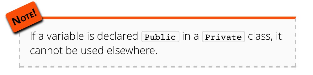
Note
My note is used to represent something of importance that should be noted.
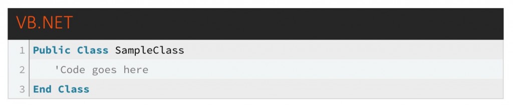
Code sample
My code sample is used to display code in it.
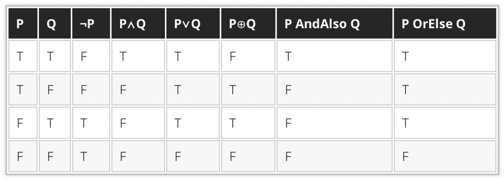
Data table
My data table is used as a table designed for holding data, rather than being used for any form of layout. The black style was inspired by the dark mode on my site.
The inline code sample
My inline code sample is used to put code in the middle of a paragraph of text.

The tooltip
My tooltip is used within an article or page to represent information that should likely be already known and is left out of the main body of the article. Hovering the text will make the tooltip bubble visible.
The image frame
My image frame is designed to hold an image. It also has space for a caption below.
The block image frame
My block image frame is different to my standard image frame in that it will take precisely 50% of the content space (minus padding and margins) and if another image goes to the side will begin floating to one side.
The photo gallery album container
The album container is a feature of my photo gallery that many find particularly nice. This is used to hold a front photo of a collection of photos.
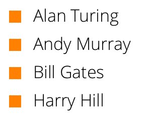
Colourful lists
In Novemeber, one of the features I decided to build was a collection of different colourful lists. A few have said they are very full of character and bring some nice new design features to my site.
The floating logo
I've had loads of comments from people who like my logo, but also people liking the fact it floats over the page.

The lined document
This document style that looks like a lined piece of paper was designed for keeping notes on my site. I use it in the University section.

I've updated a few features on the site, particularly I've had to remove the snowflakes animation as it was slowing the performance of the system that was browsing the site - not good for usability!
I've also added a more friendly settings panel as pictured:
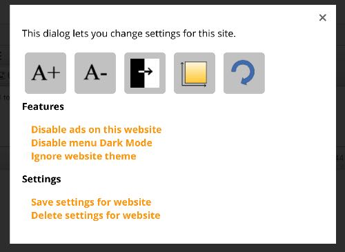
When the settings button is clicked this appears as a modal dialog like a lot of other features across the website.
I've also changed the search box, and whilst it looks the same, it is far easier to maintain and should appear better on older browsers, including old versions of Firefox and IE.
I have updated my search box on my site four times since the start of 2013, and I'm never entirely sure what design to go with. I currently like the design of my search box but it is so flawed that it's become such a site hinderance. Even now, as browsers get better and better, things just don't always work the way you planned with websites.
Tomorrow evening I will begin a new search box. You can tell me what you think in the feedback form.
Whilst not necessary, I do build a lot of customisation features into my website. One such feature is the Invert Colour feature that inverts the colour of the page and it's contents - using a black background and white text making it easier to read. All features are used throughout the browsing session of the site or you can choose to store them in a cookie on your computer so that every time you visit the site these features are enabled.
Now I'm adding another customisable feature to my site with Dark Mode. Dark Mode is a similar functionality to Invert Colour. The only difference is that it only affects the menu. Please take a look at this:

Aim: The aim of the latest update was to make the website more consistent across multiple platforms.
In the last major update prior to this (3.4), I changed the site to have multiple fonts across the different platforms: Helvetica was used on Macs and iOS devices and Segoe UI on Windows and Windows Phone devices.
Today, I'm happy to announce a cross platform Open Sans font has been installed on to this website. As well as that there is a far more consistent search box on the site with no issues on any of the modern browsers.
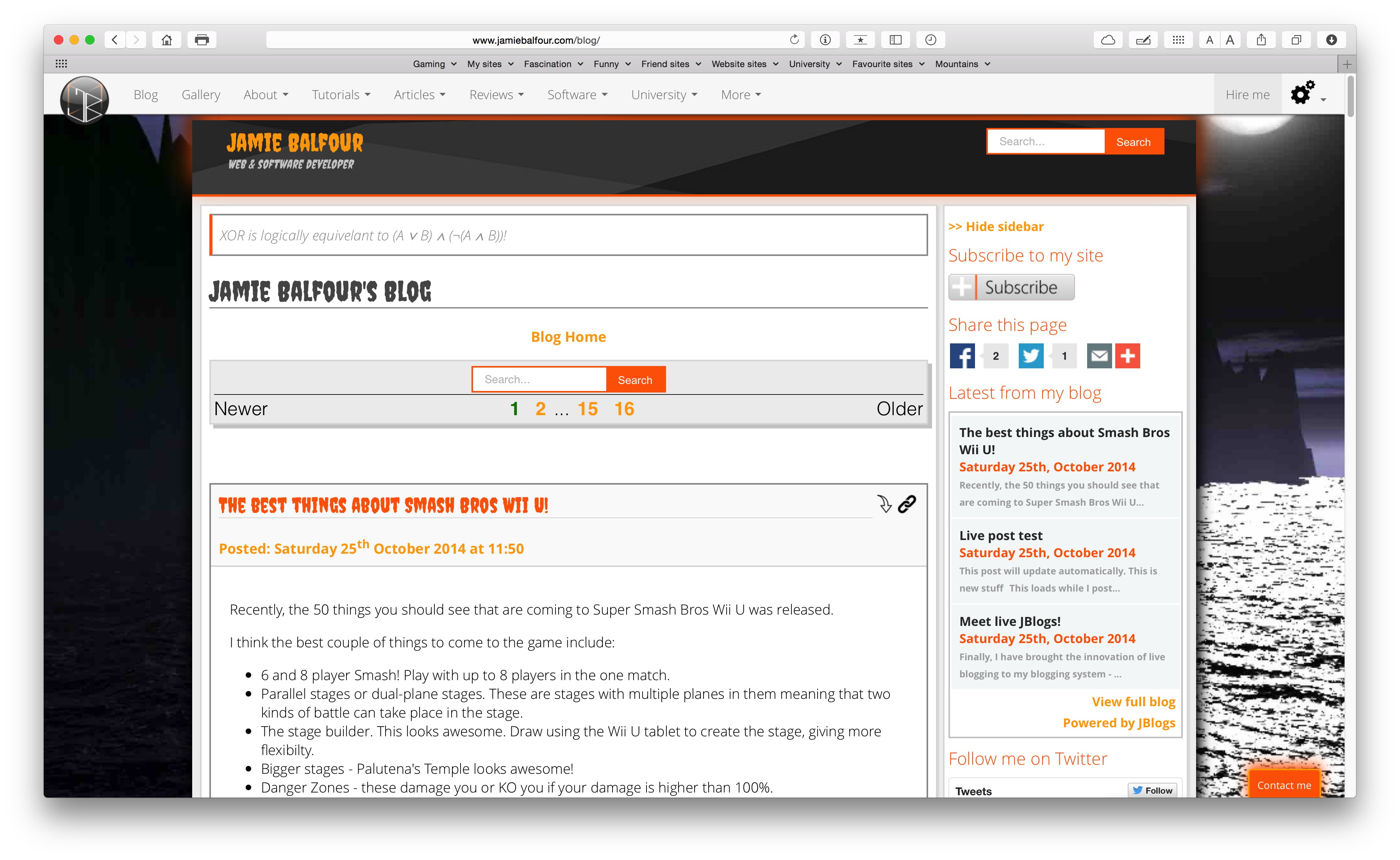
Safari
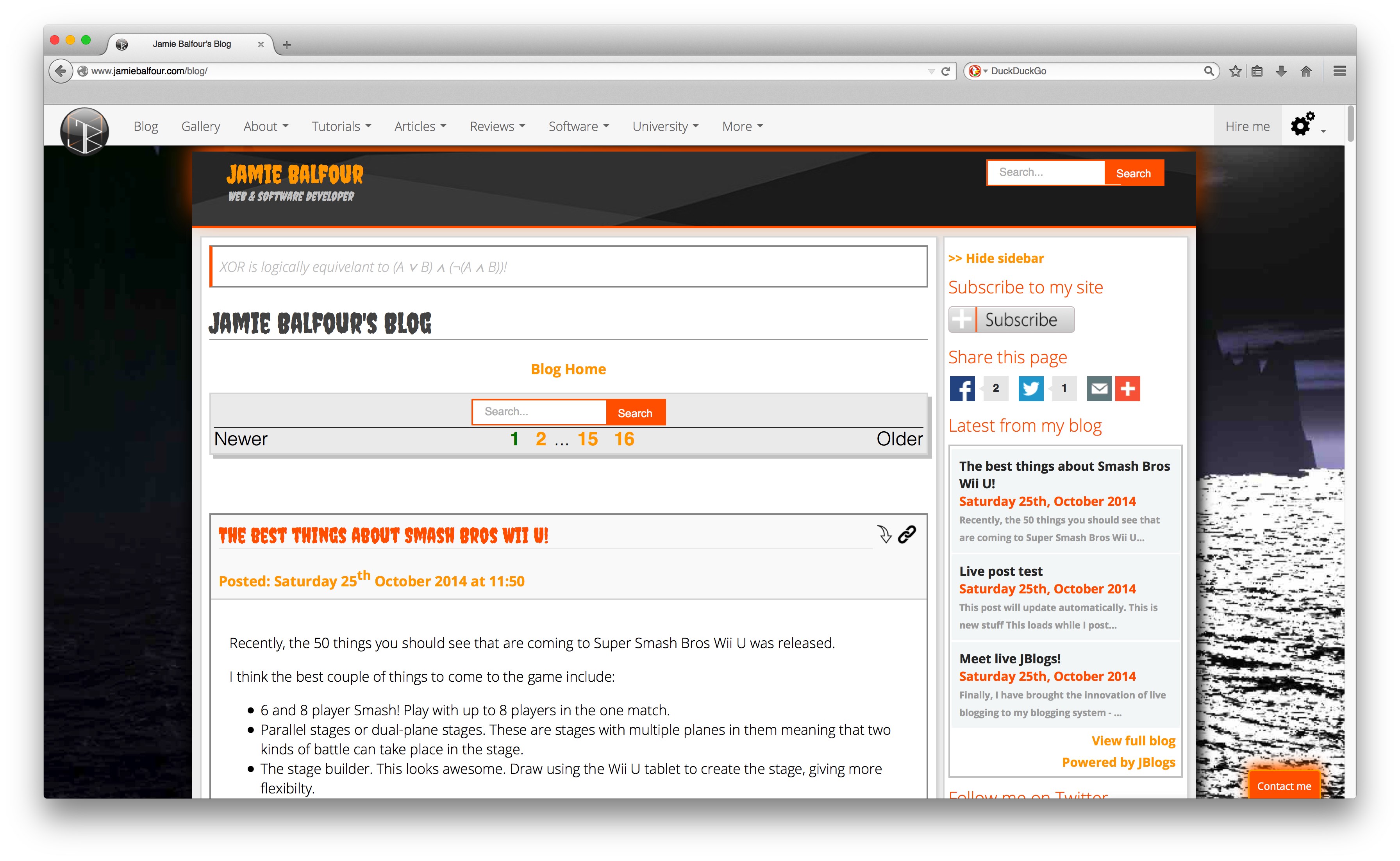
Firefox
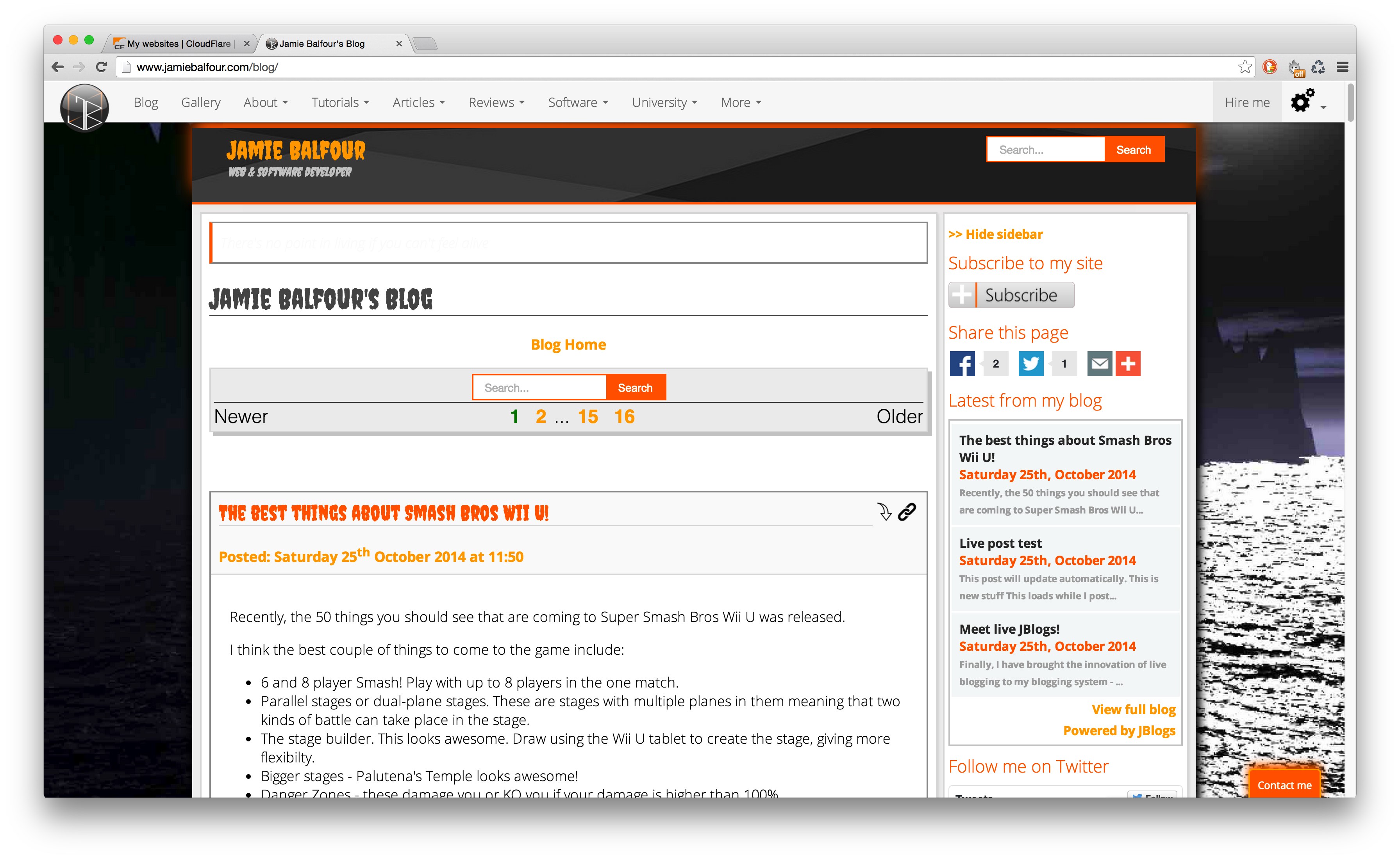
Chrome
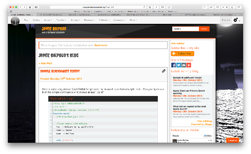
As I did last year with my website, I have decided to theme my site based on events like Halloween. This year the site is totally different from last year with a special font for the top and the headers. The site will still work as before, only some parts will look different.
Enjoy.
For the last few days, until today, my website has been suffering from some troubles due to server problems. I would like to say that the server is running fine now and my website displays correctly.
I have not been adding a lot of content to my site because of the fact that I have resumed university, but I would like to point out that the Python tutorials are coming along now.
Within the next year or so I intend to extend my tutorials further by adding 10 new tutorials in the following:
- Apache webservers
- BlackRabbit Script
- C#
- CodeIgniter
- CSS
- Java
- JavaScript
- Java Server Pages
- Latex
- Python (I'm learning more about this day by day)
This will likely be the last post about improvements on my website because I intend to stop fixing my site from now on.
The changelog has been getting less and less attention because of the fact the site is very neat and how it's meant to be.
So this post will cover the latest things to be completed on the site.
Firstly, it's performance has been improved considerably, pages have shrunk in size considerably as mentioned in a previous post. This means it is faster to download and view the site.
Secondly, a new design was tried on my website, but it moved back to the previous design - I am honestly happiest with the design as it is.
Thirdly, it's had some new features added and older less used ones removed.
Fourthly, most inline styles have been removed.
Finally, the blog is looking really looking good.
My website has taken yet another step in the right direction being optimised further, which further reduces the size of the site.
Currently, the largest page on the site is 1.6MB, which is a large page for a mobile phone user to view, but apparently spot on the average page size according to this website. Having said that, my largest page is actually my photo gallery, which is not exactly something I imagine mobile users to be using everyday.
My front homepage comes in at just 795KB and my About me page comes in at 728KB.
Most of this saving comes from gZip being applied to everything on the site, minified CSS and JS, compressed images, much less HTTP requests and less third party linked tools.